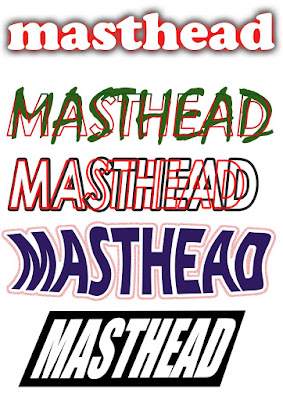
The first one I simply used the font 'Cooper Black' , colored it white and then selected a red outer glow on FX.
The second one, I used the font 'Viner Hand ITC' and colored it green. I then chose the font 'Century Gothic' , set the fill to 0% and used the stroke as a gradient overlay on FX and used the 2 colors green and red.
The 4th one, I used the Horizontal warp and squashed them together.
good examples of the skills- you have explained how you did it?
ReplyDeleteneed to know the creative process of your choices
- which ones did you like and why?
- what combinations worked best and why?
- what was difficult?
- what problems did you have to overcome?
It would also be nice to
compare and contrast to your earlier attempts at manipulating text in terms of font / colour and warp text.