For part of the advertising campaign for the clothing brand, Culture Clothing, I will be creating a series of print based adverts. The whole demographic and genre of the clothing is initially casual street wear for everyday use. This will be hugely interpretated by the way the adverts are presented on the page.


For the development, I at first created some thumbnail skteches to give myself a concept of what I want the print adverts to look like when I put them together. 


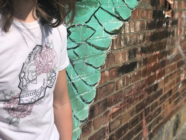
For the images used for the print products, I went around the city of Liverpool, looking for places that have graffiti and variations of street art. Areas such as Jamaica Street and the Baltic Triangle are very good for this as it is everywhere you look. I got the pictures that one, shows the T-shirt and the design that is on it, but also shows the street art, to give it that aspect that it is a clothing brand for everyday use and casual wear for anything.
The Pictures:


Billboard Print Advert
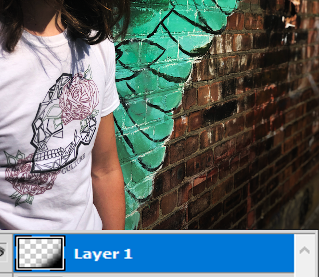
For this first print, I am aiming towards the billboards that you may be able to see when walking along the highstreet or driving by. This means it has to feature everything. I started by bringing in the first image where it is a close up of the shirt infront of the wing graffiti you can find on Parliament Street. I did not really like the natural lighting of the image and I wanted to darken the tone and make it look like it was more professional. I simply done this by adjusting the brightness and contrast in Photoshop, which made the whole image look a lot better as it allowed the graffiti and wall's detail pop out and making the image as a whole to feel warmer. To add a little more contrast, I simply used the brush tool on a soft brush and brush over a corner in black then lower the opacity down a little to allow more shadow. To me, this instantly sets the mood of the company and how the brand convey themselves.


To finish the first print off, I added deatil inside the image that represents the brand and gives it a name. I include the branding, with the name of the brand and brand logo, as well as where you can find the brand if you are online, but also states that retailers do also stock these shirts and you can find the brand on the highstreet.

To give that impression even more and make the print look alot more realistic, I have used mockup templates from MockupWorld.com. This is essentially Photoshop files (PSD) that consist of layers that have been converted into a smart object. You double click thumbnail of the layer and a new document appears allowing you to include your design. You then press save, go back to the orignal PSD file in your tabs and you will see you design featured on whatever mockup template you have chosen, in a way to give you a prespective of it would look like on a real life version of the mockup. These mockups can come in all kinds of variations and models and are very useful for those who pursuen careers in design etc. You can come across mockups such as T-shirts, album covers, lightbox advertisments, logo paper, football shirts, shop signs and many, many more.
Here are the billboard mockups that feature my billboard advertisement in different locations, which is useful so the general public can see these no matter where they go.


I have completed a few more variations for the billboard templates (shown below with and without mockup) to give the variations of design and choice for the brand to use when advertising their products. I used the same techniques have adding shadow and contrast as well as light to bring out detail in the design, using more of those pictures that I also took, on the trip to Liverpool city.
I experimented a little more with the lightness, brightness and contrast as well as the levels and the color balance, which in Photoshop, are under Image > Adjustments in the menu bar at the top. I, of course, included the name and the logo to give it the identity and branding it needs to be recognized and to gain potential customers. I put the words 'Culture Clothing' in a clearer font than the other billboard. This font is called 'Century Gothic' and classed as a sans serif font, which compared to the serif font I have used, looks a lot more clearer and modern, fitting with the casual fashion trends we see around our day-to-day lives.
 |
Light Box/Bus Stop Advert
One of the most seen advertisement boards are light boxes which we see numerous different adverts for different services and products being shown. The best example of these would be bus stops when they have around two or three adverts that get shown numerous times whilst waiting for the bus. I decided I would use this type of method and use this as it is one of the best times to get the brand out there whilst passengers wait to board the bus.
What I did here, was the same for all of the other print products I have made. I have messed about with the lighting and contrast, using the adjustments under the bar menu,image. I once again used a different image to show variation and make use of all the other images I took during my trip to the Baltic Trial in Liverpool. I then included the necessary implications to allow it to fit the code and conventions of a print advertisement followed by saving this document onto a mock up template of a bus stop to give it that realistic view in a real life situation in society.


I also decided to bring them onto the light boxes that you can see scattered around on the high streets or areas that are heavily populated. It shows that Culture are heavily investing in advertising their brand and exposing themselves to a wider audience and aiming to be seen constantly.
I did decide to create a new advert for this again as it shows variety in ideas and in products. For this I had to use a T-shirt mock up template as I do not have a physical version of the shirt to wear or showcase. This however, would allow me to have a different layout, with the shirt on a hard surface, once again showing variation in designs of advertisements. I simply changed the colour of the shirt and included a design that I have ready to print on the shirts. I then brought this into the light box mock up template that I downloaded and included the necessary requirements to advertise the top. This included the words and branding, as well as playing with the lighting, contrast, shadow and levels to get the correct affect.

Print adverts in different situations
The last print idea I had was to create an advertisement for the Culture Clothing store that will be opening. I took inspiration from the popular Liverpool brand, Lost Soles, who worked themselves up to become the most prolific clothing for men in the city of Liverpool. I decided it would be good to advertise a store dedicated for Culture and their clothes as it would bring more and more people towards them and purchases being made. This would essentially make the brand grow in popularity the fact that there would be a store and advertisements for it, the brand would see an increase in exposure and gains for having those facilities. To make this poster, I am simply having a white background with the brand logo and phrases letting the general public know. However, the white background will have a little design within giving it a marble-like effect to make it look a little less plain. This would be simply done on Procreate for Apple iPad and brought into Adobe Photoshop (on the mock up of a poster) then lower the opacity to make it look like the design is in the white page. Below is the marble effect I will use and a YouTube Link on how I created the image.  |
| Click the image to view video |


As shown above, you have the poster that shows that the Culture store will be opening. I included the marble effect with the lowered opacity which allows the poster containment's to be shown more clearly. The layout is pretty standard and the way the words are shown on the page, clearly tell any pass by there will be a new store. I also decided to include the phrase 'We cannot wait to meet you!'. I done this because
To finalize the print adverts, I decided to include all these designs on different variations of mock ups that would be regularly seen throughout a city and useful for an advertising campaign. They are the advertisements in which I have already made, just placed onto different mock ups to shows how diverse the campaign is and how they can be used anywhere.


Comments
Post a Comment